

Have no fear of perfection,
you’ll never reach it.Salvador Dali
Web design involves many different skills and disciplines that help you build and maintain websites. The different areas of web design include web graphic design, user interface design (UI design), authoring, including standardized code and proprietary software, user experience design (UX design), and search engine optimization (SEO).
Often many individuals will work in teams that cover different aspects of the design process, although some designers will cover them all.
The term "web design" is normally used to describe the design process relating to the front-end (client-side) design of a website, including writing markup. However, in this article, we will discuss broadly some UI/UX design principles, how to be good at them, and how to make our websites beautiful.
In short, if you want to master design skills, this article is for you. So, without wasting time, let’s get started.
How to Design a Product
For non-designers, it's a bit scary to start with designing a product. This product can be anything, for example, a logo, website, an app or, anything that comes with a design.
Web designing is a promising but incredibly challenging field. You need to have both technical knowledge and creative skills to be a successful web designer. As a designer myself, I would love to share the things that I've learned so far.
How to Use Colours and Colour Theory in Web Design
Though we should not judge anything by its looks alone, it is true that first impressions always count. This is especially true for a brand, since in this busy world what most of your customers will see is your brand's colour (s).
Colours evoke emotions, feelings, and convey certain information. This enables customers to form a first impression without even knowing what your product is about.
If you’ve decided to branch out from a company and start your own business/startup, understanding the impact of colour on consumer behaviour will help your brand become a success.
Research shows that up to 85% of consumers believe colour is the biggest motivator when choosing a particular product, while 92% acknowledge visual appearance as the most persuasive marketing factor overall.
We all know that red is associated with danger and green is associated with nature, but both have additional meanings and associations. Colour psychology is the study of how colours affect perceptions and behaviours. It allows us to understand colour and use it to our advantage, especially when it comes to marketing and branding.
A lot of research has gone into colour theory. You can definitely get lost down the rabbit hole of finding the story behind each colour. So here’s a quick summary to give you an idea:
- Red: danger, excitement, strength, love, energy
- Orange: confidence, success, sociability, vitality
- Yellow: creativity, happiness, warmth, cheer, optimism
- Green: nature, healing, freshness, quality, sustainability
- Blue: trust, peace, loyalty, competence, depression
- Pink: compassion, sophistication, sweetness, feminine
- Purple: royalty, luxury, spirituality, ambition
- Brown: dependable, rugged, trustworthy, simple, earthly
- Black: formality, dramatic, sophistication, security, luxurious
- White: clean, simple, innocent, honest, minimal
- Multicolor: united, open-for-all, diverse, fun
Of course, within this spectrum, there is a raft of additional colours. Different hues, such as baby blue, hot pink, or navy, also contribute to the colour story.
Before using any of these colours, you need to first identify your brand’s essence, its goals, services, and how you want your targeted customers to feel about it. That way you can help further narrow down your colour scheme.
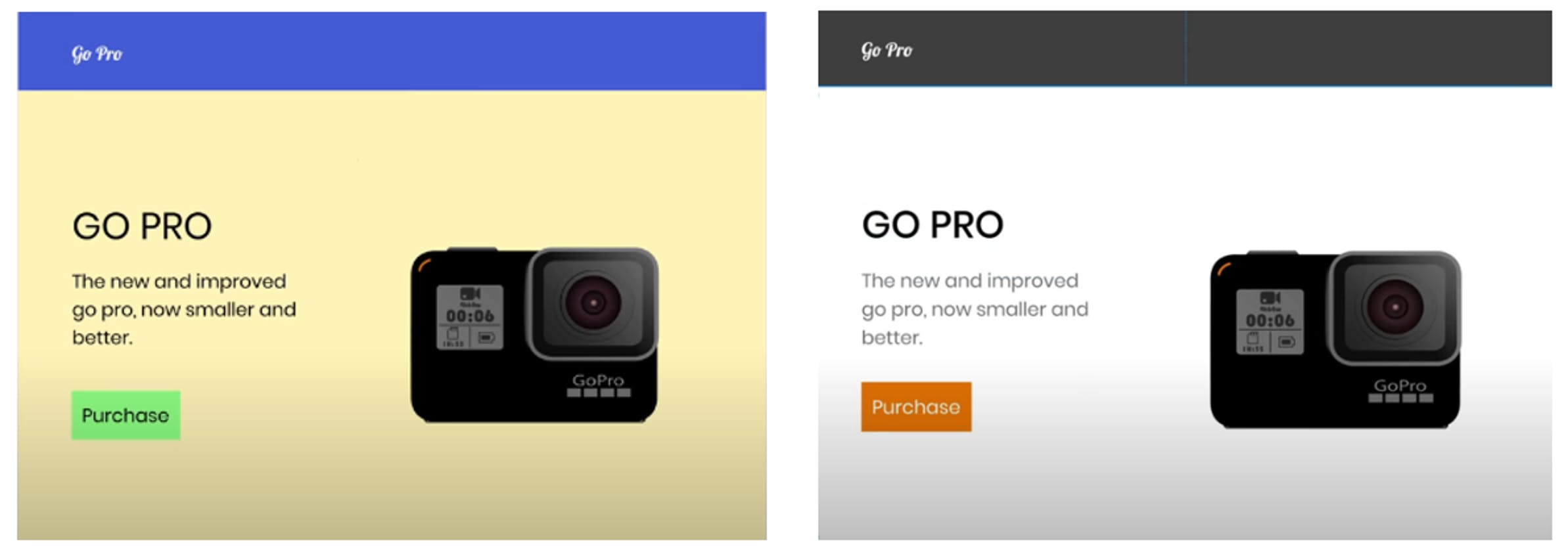
Most of the time, we can tell which colours and combinations are not professional merely by seeing a website – but we can still fail to apply suitable colours to our own creations. Tell me which website uses colours more professionally?
How to Use Contrast in Web Design
Web design consists of different elements, including typography, colours, shapes, whitespaces, and so on. When it comes to synchronizing these elements, the most basic stuff is perhaps the contrast.
Now, when we say contrast, the first thing that comes to our mind is colours. Choosing the right colour contrast is something that is part of our daily lives – for example when it comes to buying clothes, accessories, and wearables. But when it comes to web design, the principles of contrast) go beyond just colours.
Every beginner designer knows that using contrasting colours is important. It’s basic that using black foreground text on a navy background would make it difficult to read the text.
Colour contrast also means how one element on a web page contrast with the colour of other elements on the same page.
Who would have thought that the size contrast also matters in web design? Well…it’s no surprise. Size contrast might be the most basic one here.
Take an example of the size of a heading and a paragraph. The heading has a bigger font size than the paragraph so that it stands out from the rest of the text.
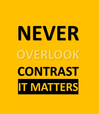
When I talk about contrast, I always show this picture.
I think this tells a lot about the importance of contrast.
How to Use Whitespace in Web Design
In general, most non-designers and beginning designers are afraid of whitespace. They often think that everything needs to contain something. But this often comes across as clumsy and too busy. Remember one thing very clearly: the more your website is readable, the better experience your customers will have when visiting the website.
Using whitespaces enables us to make our design already look a lot better with just a very little amount of effort.
In fact, Whitespace in design composition is the same as the use of silence in a musical composition. Without a proportionate use of silence, music is unstructured – some may call it noise. Similarly, without whitespace, web design is unstructured and difficult to consume.
Designers use whitespace as an integral part of their design for good reasons. When used well, it can transform not only the design but also the business for which the design is made. Whitespace significantly boosts not only the UI (User Interface) but also the UX (User Experience) of the page.
Using whitespace evenly makes the content in the design easily scannable and significantly improves legibility. A study found that proper use of whitespace between lines of paragraphs and its left and right margins can increase comprehension up to 20%.
Whitespaces help greatly in guiding the users through the page and prioritizing the focus area for the user.
Whitespaces help us by increasing interaction rate, guiding users through logical groupings, establishing a branding and design tone, and creating a breathing space for users.
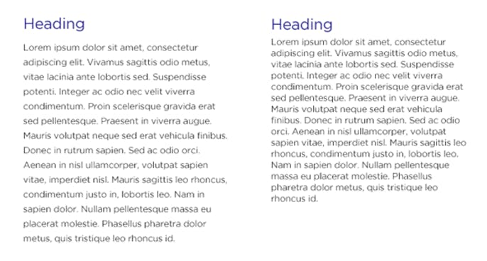
Tell me which article is more readable?
How to Use Typography in Web Design
There are thousands of different typefaces and fonts available to designers today. Most are available in a digital format and can easily be used with modern computer technology.
The vast number of typefaces available makes it hard to classify every single one. But it is important to have an understanding of the basic styles of typefaces to help you narrow down your research and select the correct typeface.
Calligraphic fonts
Letters associated with the art of calligraphy and the fonts developed from their production can be classified as calligraphic.
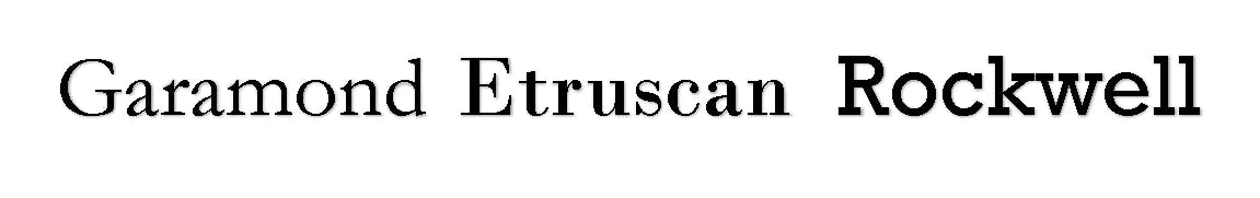
Calligraphic letters can be, although do not have to be, classified as Chancery, Etruscan, or Uncial.

Blackletter fonts
Blackletter typefaces are a script style of calligraphy that was popularized in German. A highly ornamental style of typography, different styles are often associated with the different regions in which they were developed and used.
The main classifications include Textura, Schwabacher, Cursiva, and Fraktur.

Serif fonts
Serif typefaces were popular much earlier than sans-serif typefaces, and include semi-structural details on many of the letters. People often refer to them as feet, although that is in no way a proper anatomical term when referring to typography.
There are many different classifications for serif typefaces, often named for their origins, including Grecian, Latin, Scotch, Scotch Modern, French Old Style, Spanish Old Style, Clarendon, and Tuscan.
Sans-Serif fonts
Just exactly like what it sounds, “sans” means without, so sans-serif is a typeface without serifs. Much like serif typefaces, there are many different classifications for sans-serif typefaces, including Gothic, Grotesque, Doric, Linear, Swiss, and Geometric. Sans-Serif typefaces are very popular among web designers nowadays.

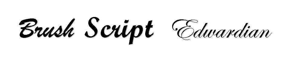
Script fonts
Script typefaces are based on the forms made with a flexible brush or pen and often have varied strokes reminiscent of handwriting.
There are many different classifications including Brush Script, English Roundhand, and Rationalized Script.
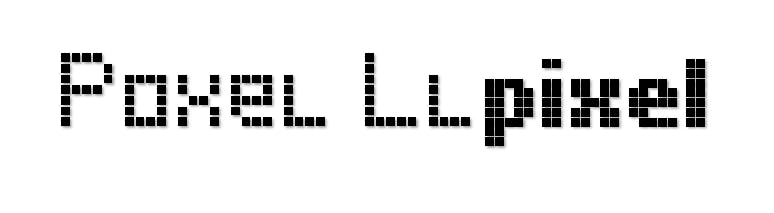
Pixel fonts
Pixel fonts were developed from the invention of the computer and were based on the on-screen display format of pixels. They are based on an array of pixels, are often called Bitmap fonts, and are often designed only for a specific point size.
Many type foundries offer a selection of bitmap fonts and some, like “Fonts for Flash”, create only bitmap fonts.
Decorative fonts
While serifed and sans-serif typefaces can often be used for text typesetting, there are a vast majority of fonts and typefaces whose legibility wanes when used in smaller point sizes.
These typefaces are often developed with a specific use in mind and are designed for larger point size use in headlines, posters, and billboards. Decorative is less of classification and can include a wide variety of typefaces underneath the umbrella of the term.

So how do you choose a font?
Well, I agree with you the typography part is the most boring part of this article. However, it’s important to know what each typeface offers us.
There are so many typefaces and fonts that have been overused, so designers nowadays never use them. When you select a font stack for your websites, you need to carefully consider the website’s contents. If it's an educational site, you can go with serif. If the site is fashion-related, go with decorative or calligraphic. If the site is for fun, you can use san-serif or pixel.
For general purposes, I recommend using san-serif and formal typefaces because they can create a powerful impact on the user's mind.
How to Create a Visual Hierarchy
After combining all these principles like colour, contrast, whitespace, and typography, web designers try to create a visual hierarchy.
Proper visual hierarchy ensures a better user experience and improves the website's readability. It is often said that users will leave a website in just 10 seconds if they don’t like its visual hierarchy.
Let’s look at a website and discuss how the designer has implemented a proper visual hierarchy.
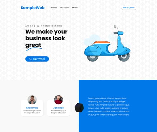
As you can see, on this website the very first thing you will notice is the big title “We make your business look great”. This attracts us most because of the usage of size contrast.
Then, you will notice the “Our work” button, an example of colour contrast. The subtitle “Award-winning design” is less noticeable because of using colour and size contrast. The illustration used beside the title, although it doesn’t make sense with this website, makes the website nothing but beautiful.
You will also notice that colours have been used professionally. The primary colour is a blueish colour, secondary is white and black/off-white/grey are also used throughout the website. Proper spacing is used everywhere on the website and the background makes the website uncommon.
In the navbar, the first thing you will notice is the brand name, then the “Get a Quote” button, and finally the hyperlinks to different pages.
Overall, if you tell me to mark this design, I will give it a solid 8 out of 10. This web design is pretty much clean and professional, tells the users where to focus more, and thus creates an impact. By the way, have you noticed that similar margins are used on both sides of this webpage?
You have seen how different principles like colour, contrast, and whitespace play a vital role to form the visual hierarchy of a page. Now the question is – how can you use those principles in your website like a professional?
Well, there are different tools that professional web designers use nowadays. Figma, Adobe XD, Adobe Illustrator, Canva, Google Web Designer are popular tools for working with web design. I personally like and use Figma because it offers most of the features in the free version and it also has a good library of plugins.
However, all of these tools are quite good. They provide necessary functionalities from writing text to creating 3D shapes and complex animations.
Using those functions and features, you can easily and efficiently create a webpage like this one. However, if you want to learn how to implement those features practically, there are so many quality crash courses and tutorials about Figma/Adobe XD on internet. Just keep in mind that:
- You shouldn't use too many fonts/colours
- You should try to maintain whitespaces between every element
- You should use proper illustrations/pictures
- You shouldn't try to make every element eye-catchy
- You should use proper and visual navigation
- You should use shadows/blur instead of using a different colour
- You should use contrast for attracting users to a specific element that needs their attraction
- You should maintain proper margins
I guarantee that if you follow these general rules and apply them using those tools, your website designs will definitely improve.
Conclusion
In this article, I tried to share as much of my knowledge about Web Design principles as possible. This information is not unique, because you can find the same sets of advice everywhere on the net. And it is a common scenario that after applying all these principles, web designers can’t make their websites what they actually want, though the website is beautiful enough.
So, my last piece of advice will be this: don’t be frustrated if you can’t make your website super cool right away – always learn from your mistakes and cultivate a habit of visiting different types of websites daily so that you can know more about recent design trends. Design is a part of our culture and cultural trends change a lot.
If you have enjoyed my writing and want to keep me motivated, consider leaving starts on GitHub, endorse me for relevant skills on LinkedIn, and follow me on Twitter. You can always hit me with direct messages.
In the end, please consider sharing this article with your friends/teammates who will find this helpful as well. Stay safe and keep learning :)